
Sounds like: shaar·trooz
It’s also known by the scientific name of yellow-green because it’s a color between yellow and green. This is one fun color to say and to use!
A little history:
First popularized in 1764, chartreuse gets its name from French liqueur.
How does it make us feel?
Chartreuse symbolizes cheerfulness, imagination, distinction, and acceptance. The effects can be it energizes, elevates, inspires, and encourages. Chartreuse is a strong yet versatile color that can comfortably shift between ultra-modern and historical and is found in nature.
Pair it with…
- Charcoal
- All shades of purple
- Turquoise
- Cobalt
- Hot Pink
- Pastels
- Neutrals
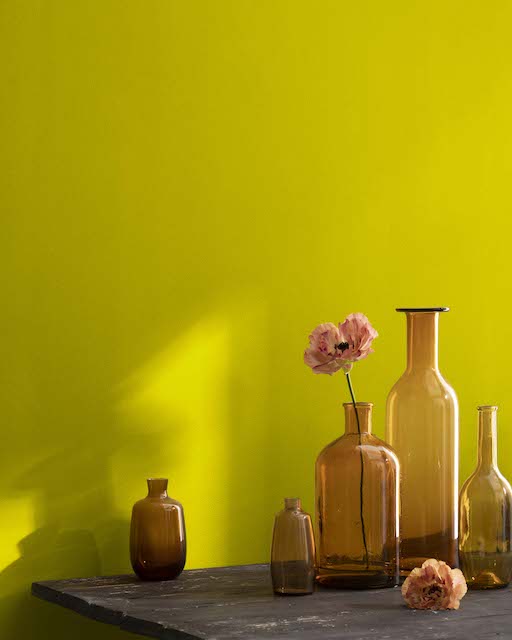
Chartreuse goes from earthy to electric, so it pairs well with other colors! Chartreuse is one of those colors that makes a statement. You can paint a whole room or do accent pieces- it’s never too much, always enough!
Chartreuse in Action
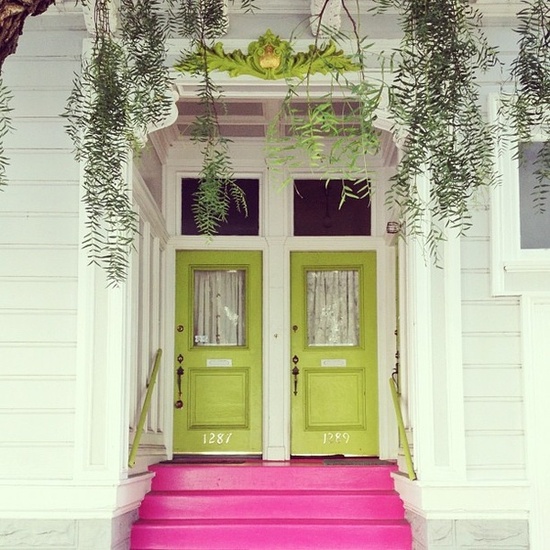
Photo: ColorMoxie.com
Who wouldn’t want to shut the front door if this is what it looked like? Paired with hot pink and white, this grabs attention in all the right ways!
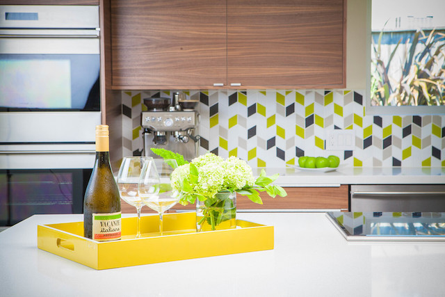
Photo and Tile from Fireclay Tile
What better way to add a splash to the kitchen than fun backsplash tile that pops chartreuse!?! We love all the style and color options available at Fireclay Tile.
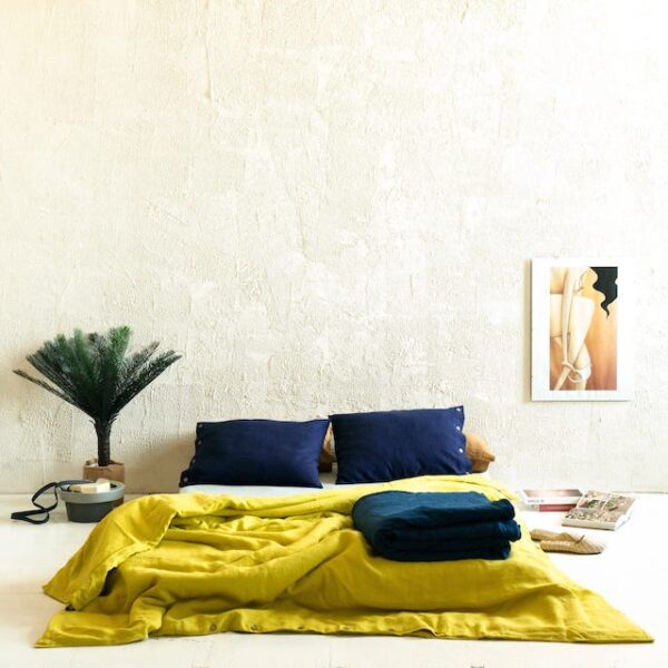
Photo and Linen Duvet from Refinery 29
LOVE, LOVE, LOVE this linen duvet paired with Navy. The balance is perfect!
Our picks for shades of Chartreuse
Savannah Moss by Benjamin Moore
Citronella Paint by Sherwin Williams
Ready to find your New Orleans home to infuse a little (or A LOT) chartreuse into it? We can help with that! Contact us!